It’s been a few weeks since we released Monzo 3.0 and gave Monzo a makeover!
This new version of the Monzo app gives us room to grow. In the past there wasn’t much space to add new features, and each time we added something new, people struggled to find it (especially things like Savings Pots, Joint Accounts, and loans).
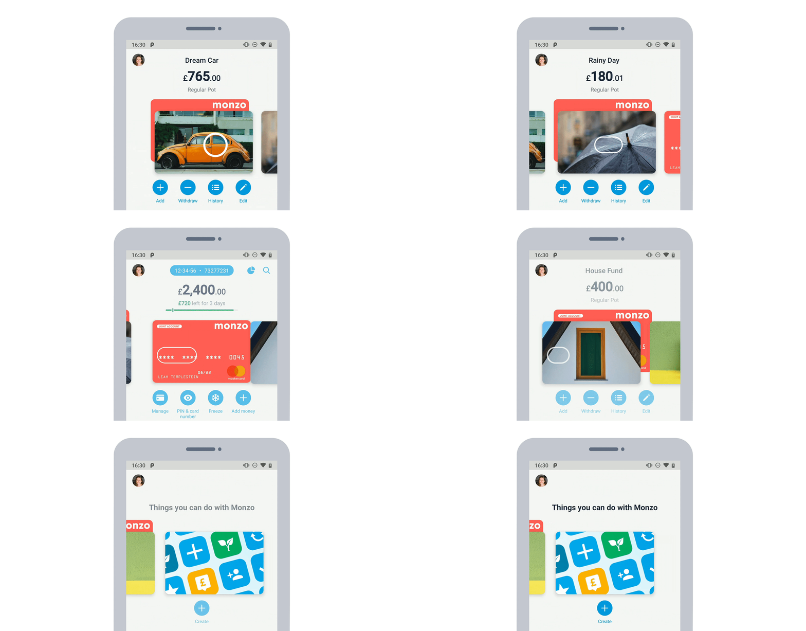
Now, instead of features living in a dusty corner, they’re big and bold, and you can access them from the Home tab. There’s also now a dedicated place to add new accounts, and find out about new features 😃

We’ve heard from you (and seen from the data) that the new layout is already helping solve these problems. But there’s still work to do!
Since we released the new design, you’ve shared lots of helpful feedback and great ideas for how we could improve it too. So we wanted to let you know what we’ll focus on improving next!
You shared lots of useful feedback and ideas about the new design
Here’s some of the feedback we’ve heard most often, and that we think can have the most impact on the customer experience.
The app feels slow, especially when it comes to balances and transactions updating.
Visually impaired people find the app hard to navigate with screen readers.
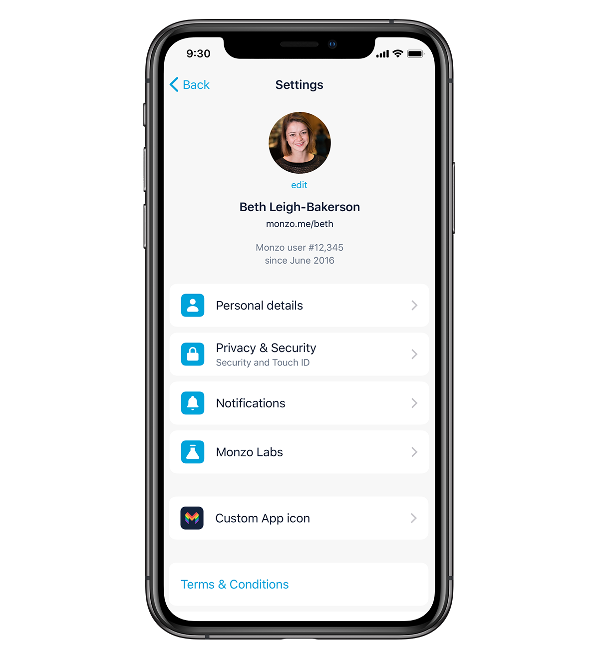
Settings is messy, and requires too many taps to get to.
Pots are now easier to find, but sometimes you want them out of sight, to help reach your savings goals.
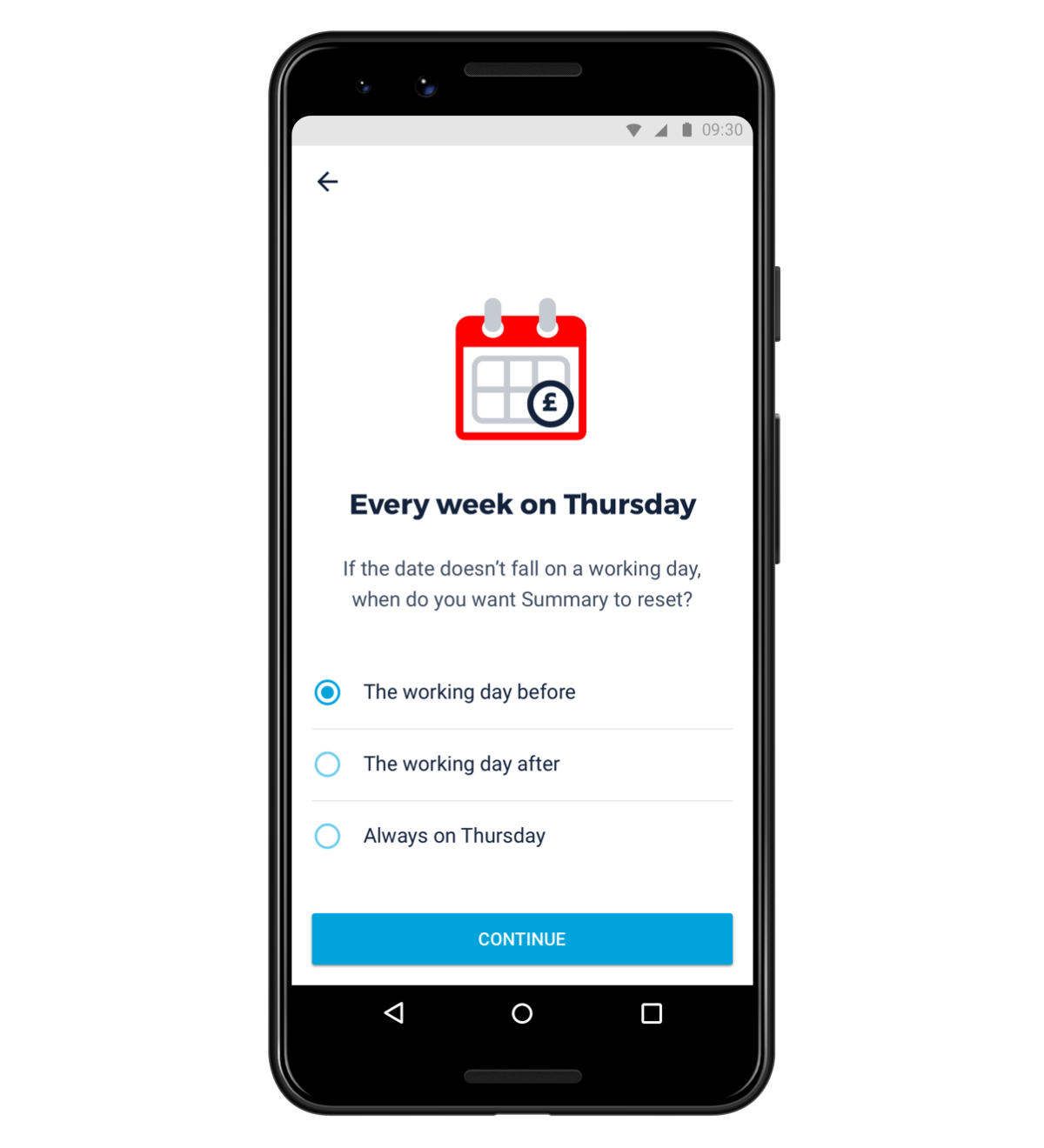
If you don’t use Summary and budgets, the estimated ‘Left to Spend’ budget on the home screen can be confusing or annoying. Some people who were used to the old Pulse graph don’t find the budget bar as easy to understand.
It’s harder to see how much your balance changed over time (you often used this to do things like make a weekly budget, or see how much your money’s growing over time).
If you have a joint account, it’s not always clear which account you’re in. Some people also want to use their joint account as their main account.
We’ll be making improvements based on your feedback
Rather than work on these problems all at once and reveal another big change, we’re going to improve things bit by bit, with smaller, iterative changes. Here’s our current plan:
First, we’ll fix the critical performance and accessibility issues. Over the last few weeks we’ve run some user research sessions with customers who use screen readers, and as a result we’ve improved how we label accounts and key actions. From the sessions, we also learnt that it was very difficult for people with visual impairments to get their card number from the app, so we’re making design changes to the feature too.
Second, we'll tidy up Settings.
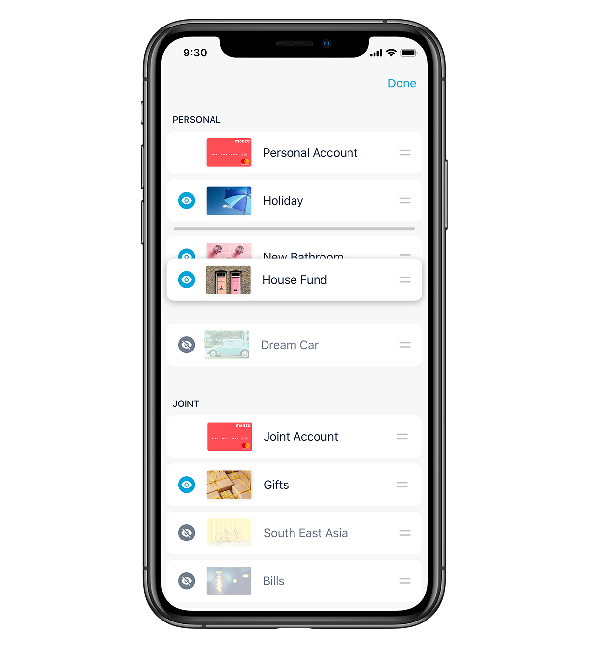
Then, we’ll make Pots easier to manage. We often hear from people wanting to order their Pots. Another common piece of feedback we hear is people needing more friction between them and their savings. (Sometimes it’s better for your money to be out of sight, out of mind!)
Finally, we’ll act on your feedback around Pulse, budgeting, and money management. We’ll work on an updated money management system that addresses these needs. Budgeting is quite complex, and very personal depending on your circumstances and setups, so changes here will take a little longer.
We’ll be posting updates and sneak peeks as we go. And we’ll share the problems we’re trying to solve, as well as our ideas for your feedback.
Here are some sneak peeks!
To kick things off, here’s a glimpse of the designs we’re currently exploring:
Tidier Settings

Weekly budgeting (to help people that used Pulse to budget)

Reordering Pots

While we design how you’ll be able to order Pots and accounts, we've also added the ability to list your joint account first in Monzo Labs.
We’re working on more integrated ways to manage these options, but wanted to put something out there quickly for your feedback. Please give it a go and let us know what you think!
Follow along on the community forum, where we’ll share more details updates of what we’re working on soon 😃